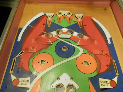
Here's another job best done in phases. Step one of repairing the playfield paint is touching up the smaller dings and scratches with a brush. It's already much improved.
There are some larger areas, however, where a brush leaves ugly streaks and a different approach is required. Time to upgrade to airbrushing. The first areas I'll tackle are the solid white blocks that will lie under the playfield plastics. I'm starting here because there's no paint matching required, they cover a lot of area, they've yellowed with age and because brightening the playfield under the plastics will reflect more light and create a brighter game.
I started by applying clear adhesive frisket, carefully cutting out the shapes and masking the rest of the playfield with scrap paper.
Then, I sprayed it with white paint.
I removed the masking paper...
... and the frisket...
... and did a little cleanup around the edges. You can already see a huge improvement. Next, I'll repeat the process with some of the more damaged off-white target labels and part of the swoosh that runs through the upper left.
I had one last round of airbrush painting: the reds at the top of the playfield were a big part of the damaged area. You'd think red would be an easy color to match, but it turns out Gottlieb's color was more like a deep orange. It took a lot of trial and error to get it right.
Finally, I was ready for a few touch-ups. Mostly re-defining the black outlines with a liner brush.


No comments:
Post a Comment